23.12.09
Sivistyksen syke - bicentennial anniversary site for Cygnaeus and Schildt
First pages of an information site for bicentennial celebration of two notable Finnish men, Uno Cygnaeus and Wolmar Schildt were published today. The bicentennial celebration will take place next year, in 2010. This is a very small information site which will contain - besides short introductions to both men - mainly the information calendar to the anniversary events. The event calendar and exhibition calendar will be opened during the beginning of 2010. I designed the overall visual look of the site commissioned by the City of Jyväskylä and the Museum of Jyväskylä University.
The anniversary will hold also an net exhibition which will open in March 2009. I'm commissioned to make graphics and execution of the site, but my work will be based on the script and vision by Anne Kalliomäki who has also written the texts to the info site.
unojawolmar200.jyvaskyla.fi
20.12.09
Christmas rush
The year has been busy. I've been planning to update my web site (and Timppa's - which I had promised already before summer) and also start a new portfolio site but somehow time manages to pass us by flying. There have been some action on art front so I won't complain. I didn't sell any works from the Poriginal Gallery exhibition but while the exhibition I got a commission of 85 prints from Central Finland
Health Care District - which was good enough reason to start to plan another trip to Tuscany, Italy. Also, I have some of my prints on "Jouluksi kotiin" (To Home for Christmas) exhibition in Rööperin taidesalonki in Helsinki until January 6, 2010.
I also made some small sites. Jussi Jäppinen ky - graafinen suunnittelu was totally a collect-the-pieces-and-put-them-together gig: the site graphics and user interface as well as the whole content was provided for me by Jussi Jäppinen and his son (working in the same graphic design agency) Juho Jäppinen, so I won't take any credit for web design there. But it was a work project allright.
I still have to finish a layout for an anniversary site for Cygnaeus and Schildt - which is laid out in the cms of the City of Jyväskylä which cuts off a lot of creativity...
So, this is christmas: snow snow snow and it's freezing cold. But candles burning and hot cocoa. And chatting with Ulla who's still couple of days in the residence in Oaxaca, Mexico. It could be worse...
14.12.09
Badges...
I designed my first snap-on badges to sell in some christmas events, f.ex. Art Museum Christmas Bazaar in the beginning of December. They sold quite well... The rest of my first badge set will be sold at the Jyväskylä Art Museum, museum shop and they will cost about 3 euros each.
I ordered another load of badge pin-back sets and hopefully I find some time to make more of these badges...
18.11.09
The Art Council of Central Finland
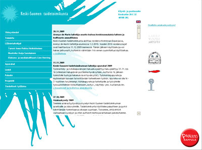
The Art Council of Central Finland website was only "sort-or-renewed". There has been discussion or the renewing for years now but nothing concrete has happened so far. The old visual layout was last time renewed in last spring to its flowery springy look but it was meant to be a temporary look only. Since the decision of remaking the site is still on hold, I decided to make at least something refreshing: the Art Council logo was re-designed on September 2009 by Aino-Kaarina Pajari and instead just placing the logo into the old site, I decided to utilize the fresh logo design in site design as well. No constructual or code renewing was make, the update was cosmetical only.
www.kstaide.net
25.10.09
Live Herring ad in Arctic & Fabulous festival mag
Live Herring and Arctic & Fabulour Film Festival have been working together since the first days of Live Herring and it was only fair that we would buy ad space from the festival mag. Plus it's a good place for us to info about our activities - even so, when we have this great show and workshop coming next March (by Sami van Ingen).
One page A5 size black and white ad.
Papiina site renewed
Renewing Papiina site was a truly awaited project: the last site design was really hard to update. The site was simplified a lot and stage was given to those beautiful designs and beautiful photos and colours instead of text and logos. I used image scrolling in some pages to give some dynamic essence to the site.
www.papiina.com
19.9.09
Emalipuu - Enamel Wood
I can't really remember when did we first start to plan the website project with Ulla and Arto (a couple who owns Emalipuu), but it was years ago. About five or six I guess? But it was a good thing that we could stew the project long enough, because now when it's done, I can proudly say that this was the most interesting and intriquing project in this year (I bet there are none web commissions like this coming, at least this year). I have visited Ulla and Arto in their home in the countryside several times with Tiina Leino who has made the printed material (calling cards, brochures, packages...) We've enjoyed coffee and talk a lot of other stuff too.
This project has been some kind of therapy for me, even though these kind of forever-lasting projects can be a pain in the ***. This wasn't. That doesn't mean that I wasn't relieved when the site was finally published.
I usually don't write any content to my commission websites. Normally I may advise with the headlines and content in general but I won't write the stories and do the copy writer's job at all. This time I took the copy writer's job as well as Ulla and Arto gave me free hands to write in my way. The texts came out a bit sentimental but overall good.
16.9.09
Animoitu liike - The Animated Movement
Finally - the time is here for animated movement...
In this year’s programme of the Jyväskylä based Time of Dance Festival there is a novel workshop that combines dance and media art: Live Herring work group organizes Animated Movement workshop in cooperation with Time of Dance Festival. The workshop is an open to all, walk-in workshop and it's organized in September 24-26 in Jyväskylä City Library.
The event is produced by Live Herring and planned by Matti Niinimäki and me. Matti and I got a joint grant from AVEK to prepare the project: Matti has concentrated on the technical side of the project and I have been working with the workflow of the workshop, the overall concept and on more artsy side background graphics - and ofcourse the printed material. The concept of the workshop was originally mine but has been since developed in co-operation with Matti.
The Finnish site of the project: www.liveherring.org/animoitu_liike
Read Live Herring feeds of the subject in English www.liveherring.org/tag/animated-movement
25.8.09
Jyväskylä Seura ry
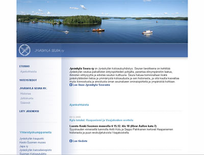
Jyväskylä Seura ry aka The Jyväskylä Society is an regional society aiming to develope the surroundings in several ways. The society wants to spread the information of the area of Jyväskylä and also tries to get people to be interested on their own home surroundings.
Making this website was a few year project (as many of those website projects for societys and associations are) and it was first meant to use wordpress as cms. But after some time, the whole idea of word press went out and I made the whole page in old fashioned way (using some ajax to ease the navigation etc. though). The site is now updated by the societys secretery.
The site design is very minimal. I had a fading background in my first implementation but the final version is very clean - and ofcourse the main colours are blue and white...
Only in Finnish: jyvaskylaseura.fi
16.8.09
Tom Waits - Rain Dogs
A three days workshop period took finally the whole week of preparing and changing the plans - especially when the target audience was not the original planned. When the workshop didn't sell out to its target audience, the orderer filled the course with its own workers and students. Which is ok otherwise but I had planned the whole three day session to a particular group of people. So, suddenly I stood there with a material I had made for many days and of which I had no use because the basic situation had changed so much. Everything worked out well however, and there were at least few people there who were very positive and thought that they had received a lot from the course. Still - it wasn't my best workshop, not even near.
The exhibition in Lahti will open in beginning of September and all the promo material with press releases and such should be already there. We made posters and invitation flyers and managed to post them on time but I still have to write some texts today and update my CV for the gallery. Actually, I was quite shocked when I saw the invitation flyer printed. I didn't require the proof before printing because I had to be in the workshop and because the image was totally the same as I used in the Jämsä exhibition (with absolutely no changes on the imagefile but the texts) and even the paper was the same. So, when after Timppa had posted all the posters and flyers and brought me one to see, I noticed that it was almost black and white. What the hell? It doesn't actually look very bad, but *it's not the original*. I have no idea if the posters are the same, since I don't have any extra posters myself but everything was shipped to Lahti. I have to go to the print house tomorrow to hear their explanation of this - and hopefully to get some price down.
11.8.09
Yeah Yeah Yeahs - Zero
My (almost) pro bono -project... I designed the The Craft Museum of Finland website about nine years ago and nothing's changed since then (besides small front page update) - until now! I decided to renew the whole site using ajax and all kinds of small improvements that help generally to keep updated information... well, up to date. The site is still in trial so there are amounts of small things still to be fixed but any way... I still have to design more dynamic background - now the site is too plain and somewhat boring when it comes to its structure. I actually designed the site last winter when there was still the old logo - which was more light and sort of "flying" and created a whole another atmosphere to the site. But anyway: I hope that the functions are now more dynamical and hopefully also the content will be easier to manage.
---
Hot hot hot. They promised thunder and rain in the weather forecast but so far only small few drops water have fallen. The air is so sticky and heavy though that I'd be amazed if this didn't lead to a grande thunder storm later today. Hopefully I have battery enough on my laptop to finish all the prints for Lahti exhibition (starting in the beginning of September).
10.8.09
Live Herring calling cards
FINALLY I got the calling cards ready to print. It only took about six months to move them from my laptop to my home computer and to change two minor thingies. Lazy me. But hey - we had something more important to do...
The card is double sided: the black side showing Live Herring is the same with every one and the other side holds the information of the card holder.
7.8.09
Smashing Pumpkins - Siva
I did it - FINALLY - after so much time just planning! I now have a small shop in Etsy: colorianna.etsy.com where I'm selling my unique colouring pictures and later also some other stuff. Like those monsterous badges I wrote about earlier: I ordered some plastic snap-on badges and I'm planning to make them very soon, after I get some of the most critical jobs done.
I also made another shop in Etsy where I will sell my smaller non-limited edition prints - later. I'll open it after I've got my other shop well running.
...And after I've managed through August. Next week is a bit frightening: at least one meeting a day, three major deadlines, three-day (whole day) course to run and finally: finishing the invitations and posters to Lahti exhibition opening in September 1st. Hmmm.
But nothing feels so bad as long as there are those warm sunny days outside. :D
22.7.09
La Roux - Tigerlily
I've been planning to make Monsterium badges for ages but for some reason I've done nothing to proceed with that project for ages. Yesterday, however, the Riiminka designers were visiting me and we made some badge designs for their collection. They've purchased a badge machine which made me to look around web for some prices etc. The badge machines are a bit expensive (well, in this state when I don't actually have the product quite ready yet and no byers to be seen) but I found some nice looking clip on badges which won't need machine at all. I thought I'll give it a try. If it seems that there is some demand for Monsterium badges, I could always rent a badge machine for a day (and I could borrow one from Riiminka, they promised). I however could first try out some clipping badges and see how they'll be received. (I also found some nice printable puzzle templates etc. Hmmm...)
I've been also making new colouring images. It's easier to find time when the weather is like this: thunder and rain and constantly turning my computer off and on. (A few years back during a thunder storm we took of all the other plugs but the old phone - which was then hit by the thunder. Even though we live in a block of flats in the city, not somewhere in the countryside. That's why I've become somewhat paranoid with thunder - I don't want to buy all the electrical devices. Even if the insurance would pay for them, I couldn't face another installation process of all computer thingies... Grrr.) Anyway, during the rainy thundery days it's nice to sit on a comfortable chair next to the living room window and just draw. Somehow it's always more rewarding to finish something hand made.
(This one in the images is not actually a badge design but part of the Monsterium poster I made last year...)
20.7.09
Royksopp / Robyn - The Girl And The Robot
[Absent 29. Pigment ink print, 15x14cm. Edition of 5.]
I sold one image from Wanha Woimala exhibition (to Canada!) and one from Pikku Galleria exhibition (to Helsinki). But gladly the Poissa - Absent series seems to be quite popular: I've used a couple of days just printing and signing the images... which isn't a lot really: I'm just slow. The hot and thundering weather makes me sooo slow in all possible ways. Anyway, I should only get my new site finished as soon as possible with all the new images and a good catalogue of my work. (*Should.*) I've tried to tell people to request the images via Gallery Becker / The Gallery of Jyväskylä Art Society which also lends out images with small down payments.
---
I also got a little surprise a while ago: Matti Niinimäki's and my "Animated movement" project got a small grant for project planning. More about the project later - the workshop (+ sidekicks) will be a part of Tanssin Aika (dance festival) in the end of September.
23.6.09
Mansun - Wide Open Space
Elsewhere - exhibition in Jämsä from June 23rd to July 14th, 2009.
Open daily, free entrance.
---
After this exhibition I have a few months break from art exhibitions, hopefully I'm able to finish my print website before the next exhibitions hit. I'm a bit late with my work projects at this time but I just have to put some extra effort... After I've returned from Medieval Festival from Turku where I'll be going for the end of the week...
4.6.09
The Mummers - Wonderland
This has taken my time: making images and all the work projects at the same time. + School.
Hopefully I'll get a tiny glance of the summer at one point...
Timo Sälekivi & Päivi Hintsanen Absent
Exhibitions in Wanha Woimala
(Naissaari, Vaajakoski, Jyväskylä)
10.-28.6.2009
Exhibitions open from Tuesday to Sunday 12-18
Free entrance
Welcome!
13.5.09
Villakas
Tiina Leino is my good friend: a graphic designer, emphasis on the print world. This very talented woman has worked about zillion years in advertizing agencies until she finally decided to move in countryside and start her own business as freelancer. A Finnish name of "Villakas" refers to something woolly - which brings out Tiina's another hobby (and hopefully work too): crafts. She will organize at least some natural dye workshops during the summer of 2009.
The site design is heavily based on Tiina's own calling card design and she has also drawn the outlines for the whole work.
Only in Finnish: www.villakas.fi
19.3.09
Malmilta maailmalle - net exhibition for Alvar Aalto Museum
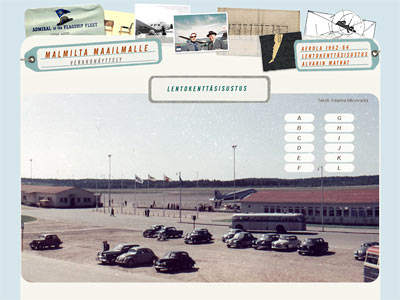
"From Malmi (airport) to the world" is a net exhibition commissioned by Alvar Aalto Museum. It exhibits f.ex. the designwork that Aalto's architecture bureau made for Aero Oy. The exhibition also shows the numerous trips Aalto made and how those trips influenced his architecture design.
For me, making this net exhibition was a great deal of fun: I got to view the old, vintage tickets, cards and Aalto's personal calendar notes. The schedule was quite tight and it was clear that I was not able to make any kind of flashy multimedia show, but - and as I understood the museum as commissioner wanted - I ended up making a clear three part site; one part presenting the housing area Aerola, one the interior design of the airport and one of Aalto's travels. I kept those three parts separate and created very simple pages for them.
Net exhibition, only in Finnish: www.alvaraalto.fi/net/malmilta_maailmalle
12.3.09
Flying (Live) Herring
There is a communal exhibition on the theme of flying in The Art Museum of Jyväskylä and of course Live Herring wanted to be part of it. We bring some old flying related films and also flying games to the exhibition. And our own flying agency A2 size poster - only three pieces were made.
I had so much fun in making this. I haven't been making printed material a lot and I've made even less anything vector based. This is most likely my first public / commission work made by using vector graphics. I used both Illustrator and Photoshop in designing this poster. I wanted the print to look old, so it was printed to offwhite matte paper - the printshop didn't have any yellowish paper on stock and we didn't have time to order one. But I'm quite pleased with outcome.
6.3.09
The Shop page for Craft Museum of Finland
The Craft Museum wanted something different for their shop - not the usual nanny-layout so many times associated to crafts but something different. The task was to create one page which could present the whole variety of the shop selection, not to create an online shopping possibilities. When I started to make layout I knew already that updating the page could be a difficult task: information runs well but photos are the issue. So the whole layout could not be based on some topical visual issues but I had to find some timeless elements. And something dynamic.
The page is actually very simple: just one page with two main items: books and other items. Books, other items and the t-shirt poser are picked randomly with every reload of the site. So, first time you may see the girl standing on white t-shirt, a book about rugs and hand made toys and the next time you come to visit you'l may see the girl standing on black t-shirt, book about socks and some jewellery made out of forks. Small product introductions will open by clicking the small images.
Because the "other items" div is placed on the right lower corner, the site seems a bit empty when viewed by larger browsers. I'm going to fill the background of the page with badge images to avoid empty spaces... - when I'll get them...
And because of the lack of shop photographer - my first photo commission ever! Quite good photos with my compact camera without any special lightning. Would not work in brochures, but on the net site - who would guess that they are not taken by a professional photographer... :D
www.craftmuseum.fi/shop/
Subscribe to:
Posts (Atom)