25.8.09
Jyväskylä Seura ry
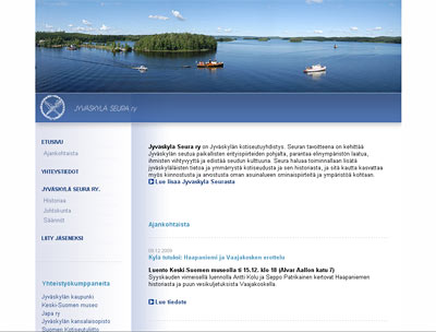
Jyväskylä Seura ry aka The Jyväskylä Society is an regional society aiming to develope the surroundings in several ways. The society wants to spread the information of the area of Jyväskylä and also tries to get people to be interested on their own home surroundings.
Making this website was a few year project (as many of those website projects for societys and associations are) and it was first meant to use wordpress as cms. But after some time, the whole idea of word press went out and I made the whole page in old fashioned way (using some ajax to ease the navigation etc. though). The site is now updated by the societys secretery.
The site design is very minimal. I had a fading background in my first implementation but the final version is very clean - and ofcourse the main colours are blue and white...
Only in Finnish: jyvaskylaseura.fi
16.8.09
Tom Waits - Rain Dogs
A three days workshop period took finally the whole week of preparing and changing the plans - especially when the target audience was not the original planned. When the workshop didn't sell out to its target audience, the orderer filled the course with its own workers and students. Which is ok otherwise but I had planned the whole three day session to a particular group of people. So, suddenly I stood there with a material I had made for many days and of which I had no use because the basic situation had changed so much. Everything worked out well however, and there were at least few people there who were very positive and thought that they had received a lot from the course. Still - it wasn't my best workshop, not even near.
The exhibition in Lahti will open in beginning of September and all the promo material with press releases and such should be already there. We made posters and invitation flyers and managed to post them on time but I still have to write some texts today and update my CV for the gallery. Actually, I was quite shocked when I saw the invitation flyer printed. I didn't require the proof before printing because I had to be in the workshop and because the image was totally the same as I used in the Jämsä exhibition (with absolutely no changes on the imagefile but the texts) and even the paper was the same. So, when after Timppa had posted all the posters and flyers and brought me one to see, I noticed that it was almost black and white. What the hell? It doesn't actually look very bad, but *it's not the original*. I have no idea if the posters are the same, since I don't have any extra posters myself but everything was shipped to Lahti. I have to go to the print house tomorrow to hear their explanation of this - and hopefully to get some price down.
11.8.09
Yeah Yeah Yeahs - Zero
My (almost) pro bono -project... I designed the The Craft Museum of Finland website about nine years ago and nothing's changed since then (besides small front page update) - until now! I decided to renew the whole site using ajax and all kinds of small improvements that help generally to keep updated information... well, up to date. The site is still in trial so there are amounts of small things still to be fixed but any way... I still have to design more dynamic background - now the site is too plain and somewhat boring when it comes to its structure. I actually designed the site last winter when there was still the old logo - which was more light and sort of "flying" and created a whole another atmosphere to the site. But anyway: I hope that the functions are now more dynamical and hopefully also the content will be easier to manage.
---
Hot hot hot. They promised thunder and rain in the weather forecast but so far only small few drops water have fallen. The air is so sticky and heavy though that I'd be amazed if this didn't lead to a grande thunder storm later today. Hopefully I have battery enough on my laptop to finish all the prints for Lahti exhibition (starting in the beginning of September).
10.8.09
Live Herring calling cards
FINALLY I got the calling cards ready to print. It only took about six months to move them from my laptop to my home computer and to change two minor thingies. Lazy me. But hey - we had something more important to do...
The card is double sided: the black side showing Live Herring is the same with every one and the other side holds the information of the card holder.
7.8.09
Smashing Pumpkins - Siva
I did it - FINALLY - after so much time just planning! I now have a small shop in Etsy: colorianna.etsy.com where I'm selling my unique colouring pictures and later also some other stuff. Like those monsterous badges I wrote about earlier: I ordered some plastic snap-on badges and I'm planning to make them very soon, after I get some of the most critical jobs done.
I also made another shop in Etsy where I will sell my smaller non-limited edition prints - later. I'll open it after I've got my other shop well running.
...And after I've managed through August. Next week is a bit frightening: at least one meeting a day, three major deadlines, three-day (whole day) course to run and finally: finishing the invitations and posters to Lahti exhibition opening in September 1st. Hmmm.
But nothing feels so bad as long as there are those warm sunny days outside. :D
Subscribe to:
Posts (Atom)