19.3.09
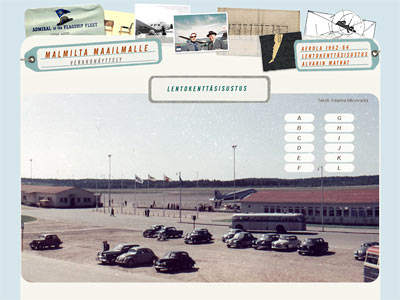
Malmilta maailmalle - net exhibition for Alvar Aalto Museum
"From Malmi (airport) to the world" is a net exhibition commissioned by Alvar Aalto Museum. It exhibits f.ex. the designwork that Aalto's architecture bureau made for Aero Oy. The exhibition also shows the numerous trips Aalto made and how those trips influenced his architecture design.
For me, making this net exhibition was a great deal of fun: I got to view the old, vintage tickets, cards and Aalto's personal calendar notes. The schedule was quite tight and it was clear that I was not able to make any kind of flashy multimedia show, but - and as I understood the museum as commissioner wanted - I ended up making a clear three part site; one part presenting the housing area Aerola, one the interior design of the airport and one of Aalto's travels. I kept those three parts separate and created very simple pages for them.
Net exhibition, only in Finnish: www.alvaraalto.fi/net/malmilta_maailmalle
12.3.09
Flying (Live) Herring
There is a communal exhibition on the theme of flying in The Art Museum of Jyväskylä and of course Live Herring wanted to be part of it. We bring some old flying related films and also flying games to the exhibition. And our own flying agency A2 size poster - only three pieces were made.
I had so much fun in making this. I haven't been making printed material a lot and I've made even less anything vector based. This is most likely my first public / commission work made by using vector graphics. I used both Illustrator and Photoshop in designing this poster. I wanted the print to look old, so it was printed to offwhite matte paper - the printshop didn't have any yellowish paper on stock and we didn't have time to order one. But I'm quite pleased with outcome.
6.3.09
The Shop page for Craft Museum of Finland
The Craft Museum wanted something different for their shop - not the usual nanny-layout so many times associated to crafts but something different. The task was to create one page which could present the whole variety of the shop selection, not to create an online shopping possibilities. When I started to make layout I knew already that updating the page could be a difficult task: information runs well but photos are the issue. So the whole layout could not be based on some topical visual issues but I had to find some timeless elements. And something dynamic.
The page is actually very simple: just one page with two main items: books and other items. Books, other items and the t-shirt poser are picked randomly with every reload of the site. So, first time you may see the girl standing on white t-shirt, a book about rugs and hand made toys and the next time you come to visit you'l may see the girl standing on black t-shirt, book about socks and some jewellery made out of forks. Small product introductions will open by clicking the small images.
Because the "other items" div is placed on the right lower corner, the site seems a bit empty when viewed by larger browsers. I'm going to fill the background of the page with badge images to avoid empty spaces... - when I'll get them...
And because of the lack of shop photographer - my first photo commission ever! Quite good photos with my compact camera without any special lightning. Would not work in brochures, but on the net site - who would guess that they are not taken by a professional photographer... :D
www.craftmuseum.fi/shop/
Subscribe to:
Posts (Atom)